World Impact › Brand Refresh & Expansion
First things first. Clean up what could be described as a 'wonky' logo, while retaining its long-vested recognition value with multiple audiences. Second, expand identity configuration options and brand color palette, & create a few core brand elements that will broaden the brand toolbox assets. Finally, show how the assets can be applied—tweaking, expanding, refining as it goes.
The selected projects under the larger World Impact umbrella (nav list at left) represent that effort over a two-year period of time while serving in the Creative Specialist role at World Impact.
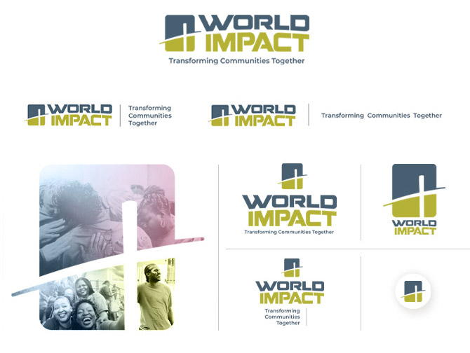
Logo Identity Configurations : core brand element
The primary lockup is the default, while secondary (& tertiary) configurations accommodate narrow width & height applications. The symbol can be used sparingly as a stand-alone element
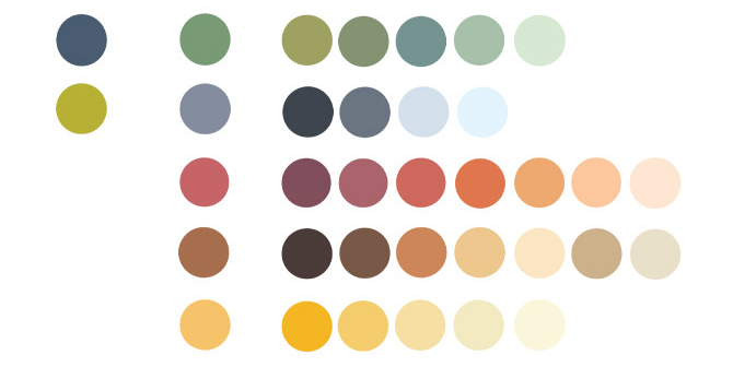
Expanded Primary & Secondary Color Palette : core brand element
The primary palette and five families of warm, earthy & inviting tones & hues allows flexibility when applying the brand across audiences & many touchpoints
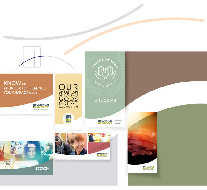
Arc/Curve : core brand element
Informed by the arc of the cross—or segment in the radius of a circle—conceptualized in the World Impact symbol, this brand element helps in creating dynamic movement/flow when applied to brand communications
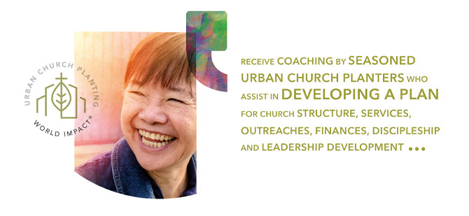
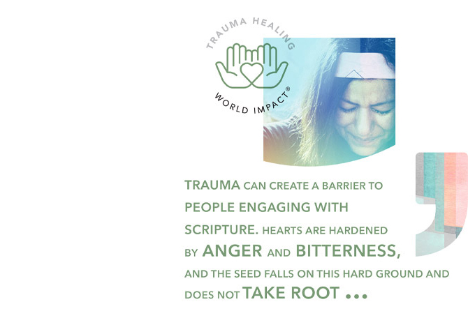
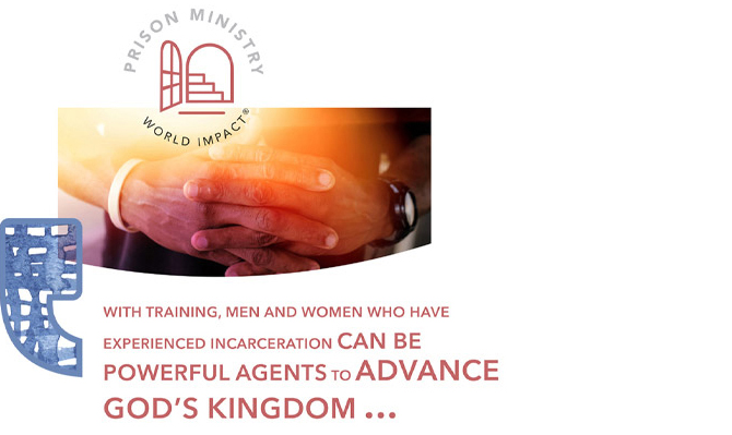
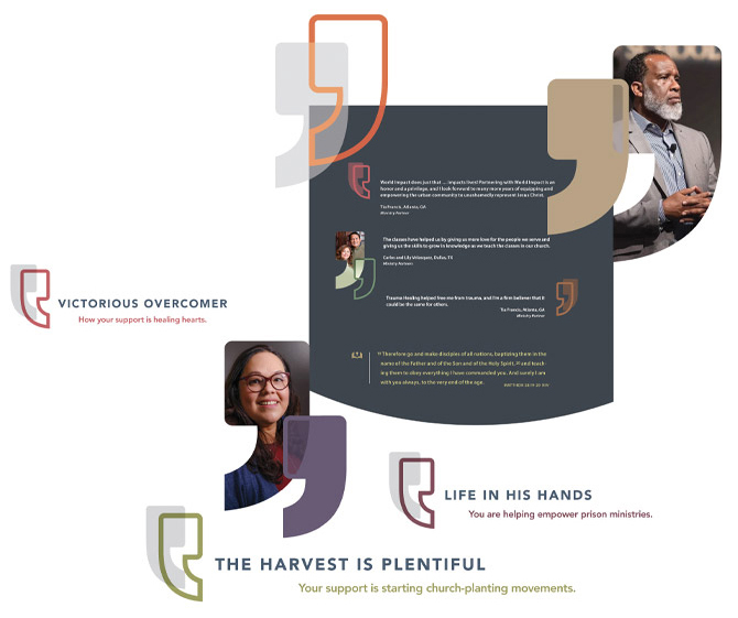
Quote Mark : core brand element
Storytelling is an important form of communication for World Impact. The consistent use and creative flexibility of this brand element puts prominence on the value of voice, and strengthens the tie between the story and it's author(s)
Story Bundles : core brand element
Combining core brand elements into a short personal story
